Up Next
Up Next
Scroll Down
Up Next
Okinawa’s Sushi Checkout Optimization

2021
UX/UI
Commerce
Client: Okinawa Sushi
B2C
Role: Lead UX/UI Designer
Contributions: UX, UI, Research
Methods:
Customer interviews, online surveys, competitor analysis, user flows, rapid prototyping, multivariate split-testing
Outcomes:
300% increase in SBP usage
8.4% decrease in cash-related delivery delays
23% increase in customer satisfaction from QR code redemption
Overview
During the COVID-19 lockdowns, Okinawa Sushi faced a surge in online orders and an increasing demand for convenient, cost-effective payment options. At that time, customers could only pay by card — with associated fees or cash. To better meet customer needs, the business added SBP (System of Fast Payments), a fee-free online payment method that made transactions smoother and more affordable.
We also received feedback from users, customer care, and fleet management teams about the following:
Difficulties with coupon redemption: Customers struggled to add and redeem coupons and were unsure if discounts were applied successfully.
Cash handling issues during delivery: Couriers faced delays due to unexpected cash change needs, leading to customer dissatisfaction.
Participant's quote: “I wasn't sure if my coupon worked until the last minute — it was super annoying.”
In response, we conducted interviews, competitor analysis and user testing to determine the best placement for adding new payment option, redesigned the coupon redemption process, and optimized the checkout flow for cash payments to improve the customer experience.

Challenge
How might we improve Okinawa Sushi's checkout and delivery process to make it more user-friendly and efficient by:
Encouraging the use of SBP for faster, fee-free payments?
Simplifying coupon redemption?
Resolving cash handling issues during delivery?
Design Process
Hypotheses and Wireframing
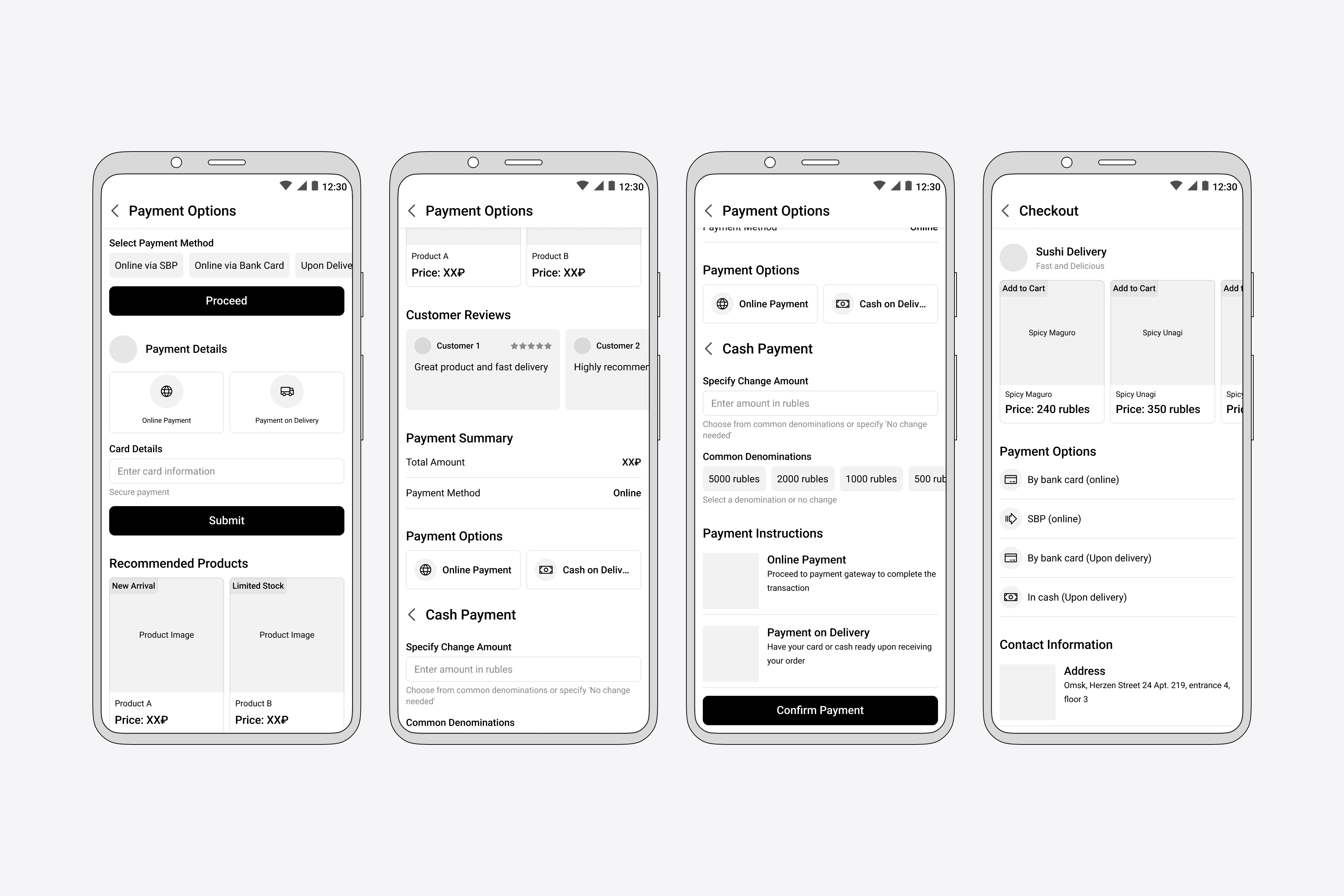
We began by creating wireframes to test various hypotheses, drawing insights from competitor analysis. We explored potential solutions like:
Highlight SBP: Position SBP as the default payment option to encourage adoption.
Combine Payment Steps: Reduce steps by merging online and upon-delivery payment selections into one screen.
Cash Handling Solution: Add an option for customers to specify if they need change for cash payments, helping couriers prepare in advance.
Participant's quote: “I never knew about SBP before, but now that I see it getting attention, I'm interested. Cool that it has no fees!”
Rapid Prototyping and User Testing
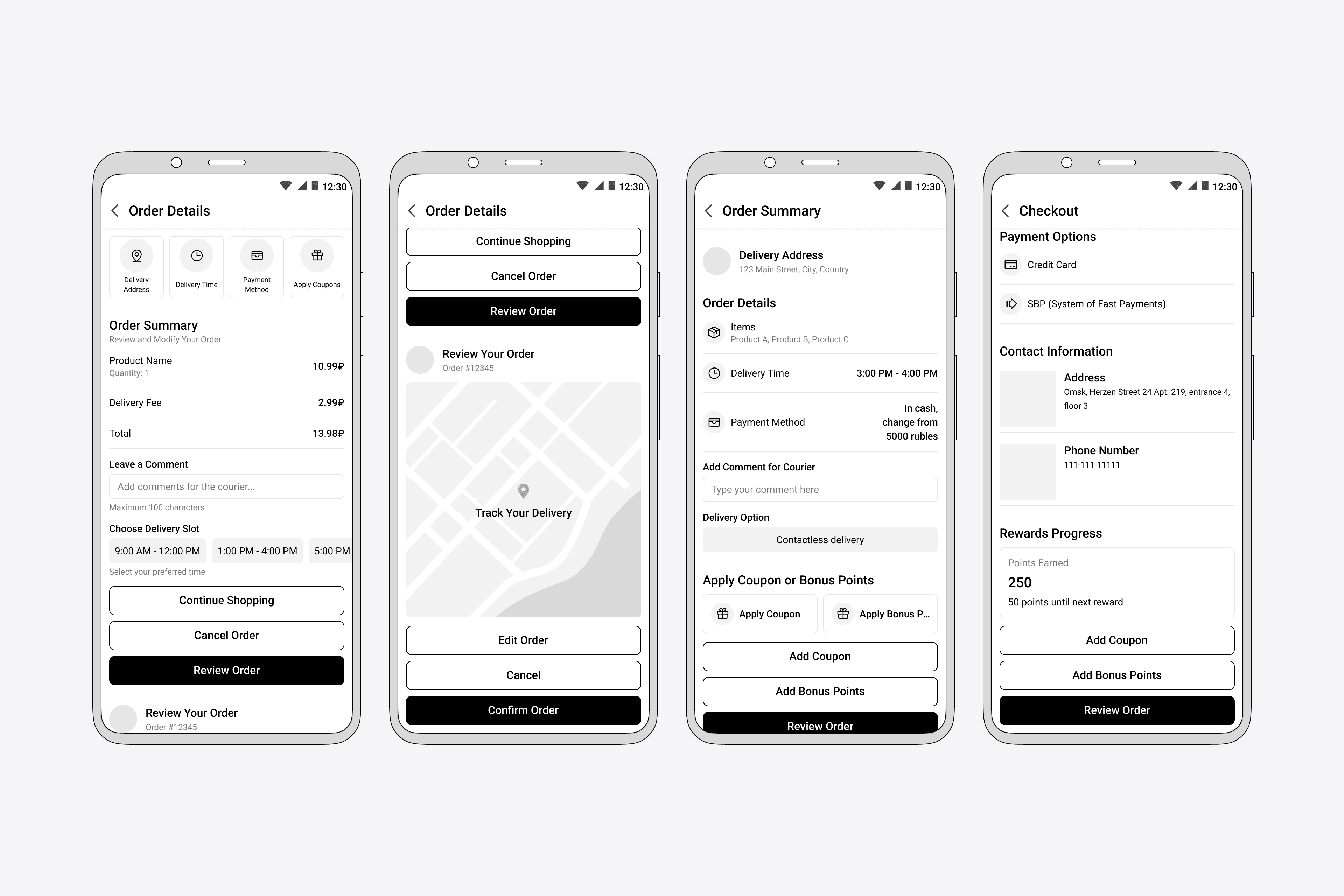
After testing our hypotheses, we developed prototypes to explore and test different checkout layouts, focusing on:
Placement of payment options
Simplify coupon redemption
Introducing cash-handling solution
User testing validated our ideas, refined our designs, and uncovered new areas for improvement.
Our Key Discoveries and Solutions
Based on the feedback from user testing, we made some changes to improve the user experience in our checkout process.
Simplified Payment Selection and Cash Handling
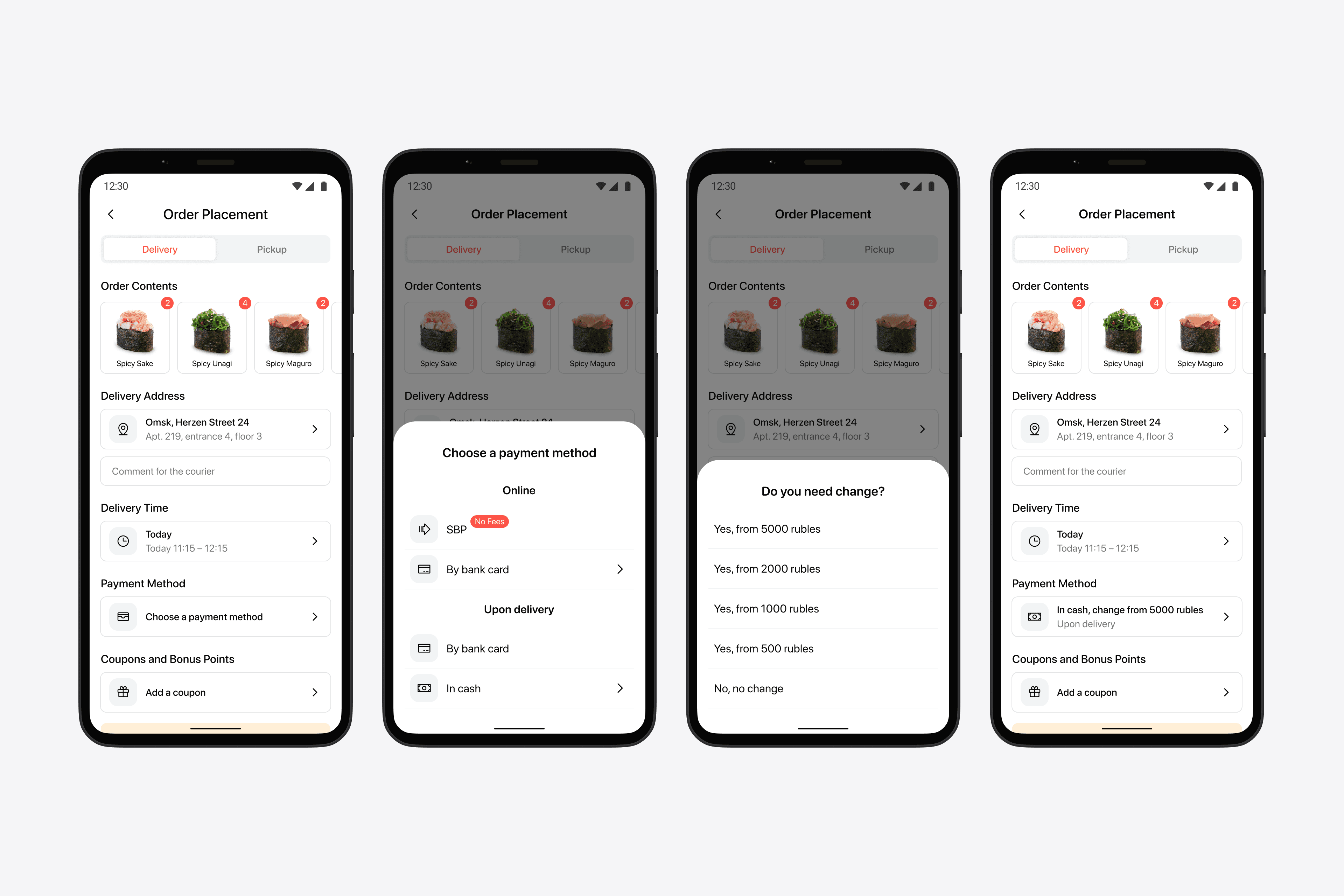
Users disliked extra steps when choosing payment methods, and cash handling during delivery caused delays and frustration.
We combined all payment options into one screen, clearly distinguishing between online and upon-delivery payments and highlighted SBP with a badge to promote its fee-free advantage. Also added a feature allowing customers to specify if they needed change for cash payments and from what amount.
In result users found the process more straightforward, leading to a 300% increase in SBP adoption and couriers were better prepared, reducing delivery delays by 8.4%.
Participant's quote: “It's way simpler now that I don't have to hop through a bunch of screens to pay.”
Enhanced Coupon Redemption
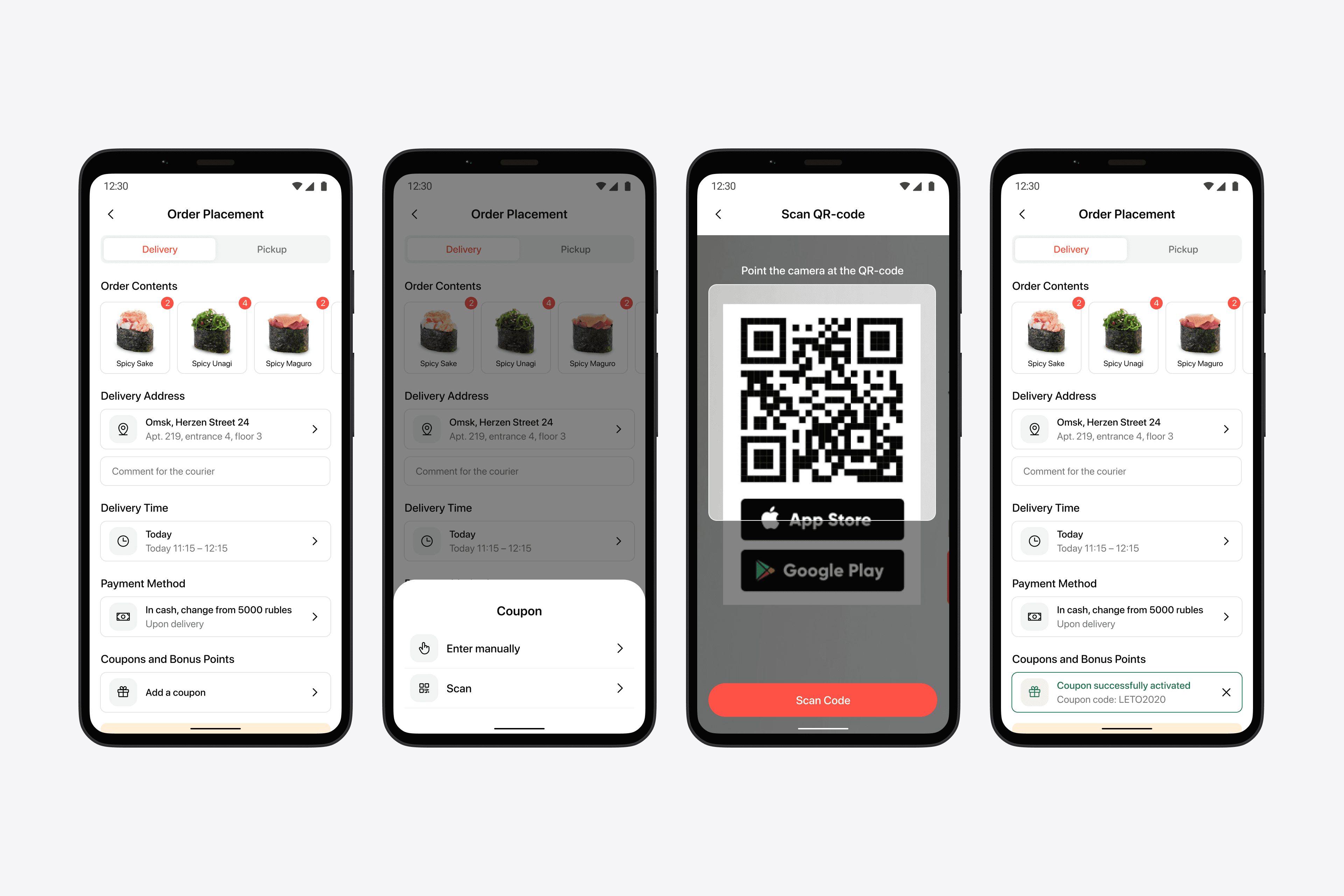
Manual coupon entry was cumbersome, and users couldn't confirm discount application until checkout completion. We added QR code scanning for faster coupon application and provided immediate confirmation messages.
In result customer satisfaction improved by 23%, with users appreciating the quick and clear discount application.
Order Confirmation Flexibility
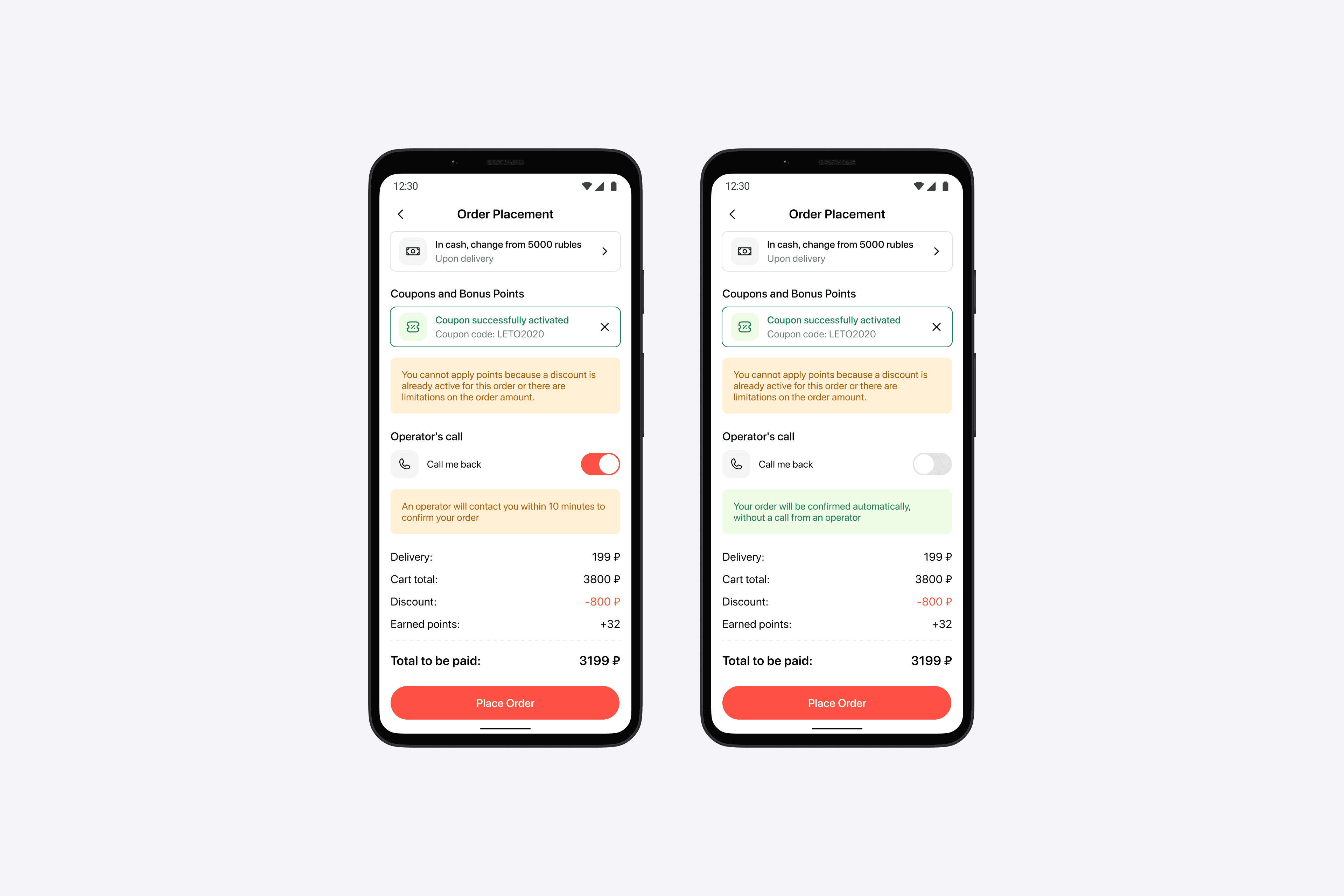
Previously, confirmation calls were the default for every order, which slowed down the process. To improve process, the business removed this step, making orders automatically confirmed. However, some users missed the option to clarify details with customer care.
We added a “Call me back” toggle. By default, orders are confirmed automatically, but users can request a callback within 10 minutes if needed.
In result this provided flexibility for users who preferred speed and those who wanted personal assistance, improving customer satisfaction.
Optimized Checkout Flow
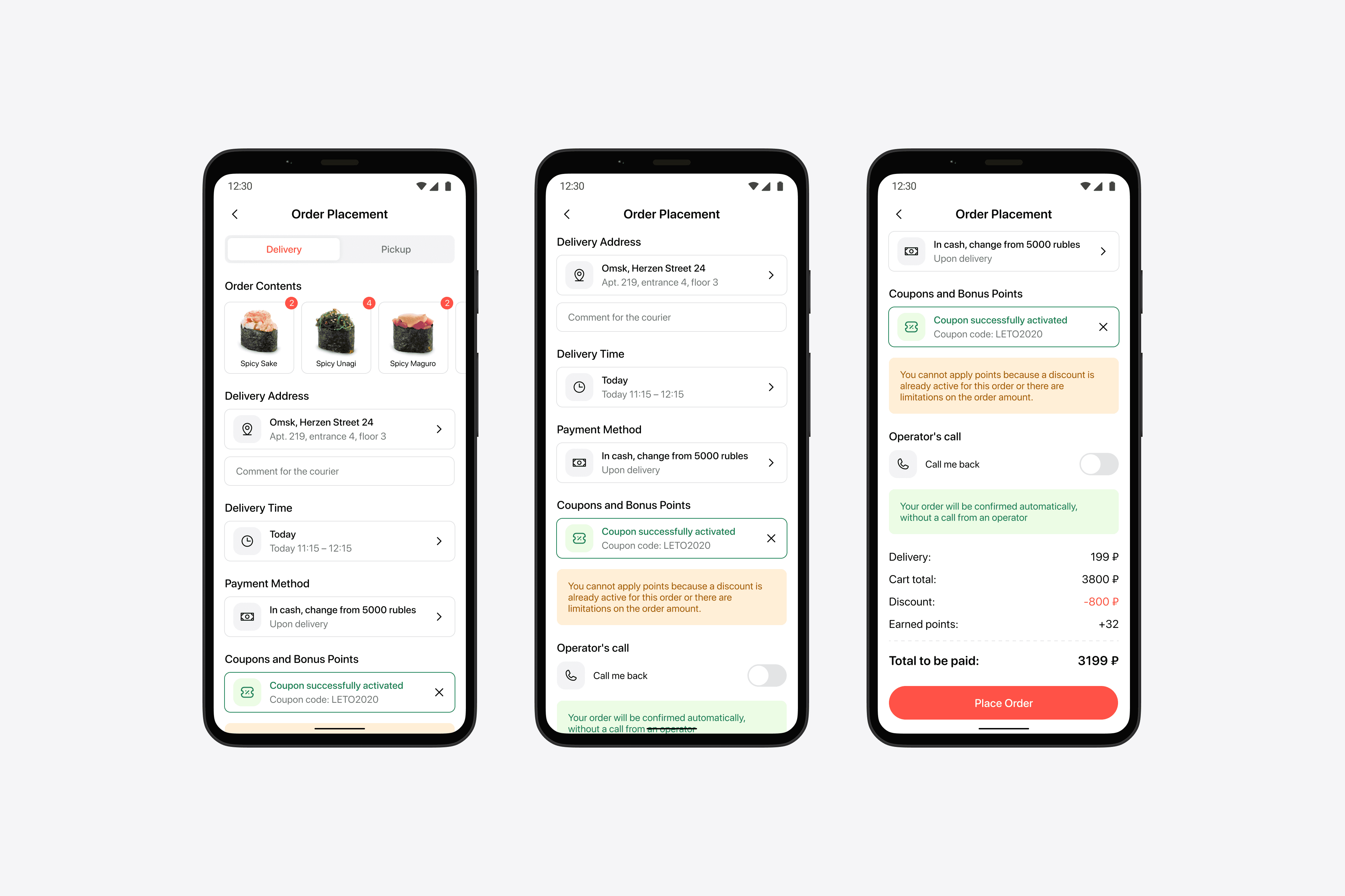
We learned that most customers preferred this sequence: first, the option to review their order, followed by how and when they will receive it, how they will pay, and finally, the option to apply discounts and manage order confirmation. We rearranged the checkout flow to match user preferences, making the process more intuitive.
In result, we improved user experience with a more logical and predictable checkout sequence.
Our Challenges and Next Steps
Not everything went as planned. Simplifying the online card payment interface remained challenging and needs further refinement. We also received customer feedback requesting the ability to upload saved QR code images for coupons. Implementing this feature is a priority for future updates.
Closing Thoughts
The new checkout process received highly positive feedback from users, who found it more convenient and predictable. A key success was the strong adoption of SBP, used three times more than card payments — a main goal of the project. By actively listening to user feedback and involving customers throughout the design process, we significantly improved Okinawa Sushi's checkout experience.
Up Next
Up Next
Okinawa’s Sushi Checkout Optimization

2021
UX/UI
Commerce
Client: Okinawa Sushi
B2C
Role: Lead UX/UI Designer
Contributions: UX, UI, Research
Methods:
Customer interviews, online surveys, competitor analysis, user flows, rapid prototyping, multivariate split-testing
Outcomes:
300% increase in SBP usage
8.4% decrease in cash-related delivery delays
23% increase in customer satisfaction from QR code redemption
Overview
During the COVID-19 lockdowns, Okinawa Sushi faced a surge in online orders and an increasing demand for convenient, cost-effective payment options. At that time, customers could only pay by card — with associated fees or cash. To better meet customer needs, the business added SBP (System of Fast Payments), a fee-free online payment method that made transactions smoother and more affordable.
We also received feedback from users, customer care, and fleet management teams about the following:
Difficulties with coupon redemption: Customers struggled to add and redeem coupons and were unsure if discounts were applied successfully.
Cash handling issues during delivery: Couriers faced delays due to unexpected cash change needs, leading to customer dissatisfaction.
Participant's quote: “I wasn't sure if my coupon worked until the last minute — it was super annoying.”
In response, we conducted interviews, competitor analysis and user testing to determine the best placement for adding new payment option, redesigned the coupon redemption process, and optimized the checkout flow for cash payments to improve the customer experience.

Challenge
How might we improve Okinawa Sushi's checkout and delivery process to make it more user-friendly and efficient by:
Encouraging the use of SBP for faster, fee-free payments?
Simplifying coupon redemption?
Resolving cash handling issues during delivery?
Design Process
Hypotheses and Wireframing
We began by creating wireframes to test various hypotheses, drawing insights from competitor analysis. We explored potential solutions like:
Highlight SBP: Position SBP as the default payment option to encourage adoption.
Combine Payment Steps: Reduce steps by merging online and upon-delivery payment selections into one screen.
Cash Handling Solution: Add an option for customers to specify if they need change for cash payments, helping couriers prepare in advance.
Participant's quote: “I never knew about SBP before, but now that I see it getting attention, I'm interested. Cool that it has no fees!”

Rapid Prototyping and User Testing
After testing our hypotheses, we developed prototypes to explore and test different checkout layouts, focusing on:
Placement of payment options
Simplify coupon redemption
Introducing cash-handling solution
User testing validated our ideas, refined our designs, and uncovered new areas for improvement.

Our Key Discoveries and Solutions
Based on the feedback from user testing, we made some changes to improve the user experience in our checkout process.
Simplified Payment Selection and Cash Handling
Users disliked extra steps when choosing payment methods, and cash handling during delivery caused delays and frustration.
We combined all payment options into one screen, clearly distinguishing between online and upon-delivery payments and highlighted SBP with a badge to promote its fee-free advantage. Also added a feature allowing customers to specify if they needed change for cash payments and from what amount.
In result users found the process more straightforward, leading to a 300% increase in SBP adoption and couriers were better prepared, reducing delivery delays by 8.4%.
Participant's quote: “It's way simpler now that I don't have to hop through a bunch of screens to pay.”

Enhanced Coupon Redemption
Manual coupon entry was cumbersome, and users couldn't confirm discount application until checkout completion. We added QR code scanning for faster coupon application and provided immediate confirmation messages.
In result customer satisfaction improved by 23%, with users appreciating the quick and clear discount application.

Order Confirmation Flexibility
Previously, confirmation calls were the default for every order, which slowed down the process. To improve process, the business removed this step, making orders automatically confirmed. However, some users missed the option to clarify details with customer care.
We added a “Call me back” toggle. By default, orders are confirmed automatically, but users can request a callback within 10 minutes if needed.
In result this provided flexibility for users who preferred speed and those who wanted personal assistance, improving customer satisfaction.

Optimized Checkout Flow
We learned that most customers preferred this sequence: first, the option to review their order, followed by how and when they will receive it, how they will pay, and finally, the option to apply discounts and manage order confirmation. We rearranged the checkout flow to match user preferences, making the process more intuitive.
In result, we improved user experience with a more logical and predictable checkout sequence.

Our Challenges and Next Steps
Not everything went as planned. Simplifying the online card payment interface remained challenging and needs further refinement. We also received customer feedback requesting the ability to upload saved QR code images for coupons. Implementing this feature is a priority for future updates.
Closing Thoughts
The new checkout process received highly positive feedback from users, who found it more convenient and predictable. A key success was the strong adoption of SBP, used three times more than card payments — a main goal of the project. By actively listening to user feedback and involving customers throughout the design process, we significantly improved Okinawa Sushi's checkout experience.
Up Next
Up Next
Scroll Down
Up Next
Okinawa’s Sushi Checkout Optimization

2021
UX/UI
Commerce
Client: Okinawa Sushi
B2C
Role: Lead UX/UI Designer
Contributions: UX, UI, Research
Methods:
Customer interviews, online surveys, competitor analysis, user flows, rapid prototyping, multivariate split-testing
Outcomes:
300% increase in SBP usage
8.4% decrease in cash-related delivery delays
23% increase in customer satisfaction from QR code redemption
Overview
During the COVID-19 lockdowns, Okinawa Sushi faced a surge in online orders and an increasing demand for convenient, cost-effective payment options. At that time, customers could only pay by card — with associated fees or cash. To better meet customer needs, the business added SBP (System of Fast Payments), a fee-free online payment method that made transactions smoother and more affordable.
We also received feedback from users, customer care, and fleet management teams about the following:
Difficulties with coupon redemption: Customers struggled to add and redeem coupons and were unsure if discounts were applied successfully.
Cash handling issues during delivery: Couriers faced delays due to unexpected cash change needs, leading to customer dissatisfaction.
Participant's quote: “I wasn't sure if my coupon worked until the last minute — it was super annoying.”
In response, we conducted interviews, competitor analysis and user testing to determine the best placement for adding new payment option, redesigned the coupon redemption process, and optimized the checkout flow for cash payments to improve the customer experience.

Challenge
How might we improve Okinawa Sushi's checkout and delivery process to make it more user-friendly and efficient by:
Encouraging the use of SBP for faster, fee-free payments?
Simplifying coupon redemption?
Resolving cash handling issues during delivery?
Design Process
Hypotheses and Wireframing
We began by creating wireframes to test various hypotheses, drawing insights from competitor analysis. We explored potential solutions like:
Highlight SBP: Position SBP as the default payment option to encourage adoption.
Combine Payment Steps: Reduce steps by merging online and upon-delivery payment selections into one screen.
Cash Handling Solution: Add an option for customers to specify if they need change for cash payments, helping couriers prepare in advance.
Participant's quote: “I never knew about SBP before, but now that I see it getting attention, I'm interested. Cool that it has no fees!”

Rapid Prototyping and User Testing
After testing our hypotheses, we developed prototypes to explore and test different checkout layouts, focusing on:
Placement of payment options
Simplify coupon redemption
Introducing cash-handling solution
User testing validated our ideas, refined our designs, and uncovered new areas for improvement.

Our Key Discoveries and Solutions
Based on the feedback from user testing, we made some changes to improve the user experience in our checkout process.
Simplified Payment Selection and Cash Handling
Users disliked extra steps when choosing payment methods, and cash handling during delivery caused delays and frustration.
We combined all payment options into one screen, clearly distinguishing between online and upon-delivery payments and highlighted SBP with a badge to promote its fee-free advantage. Also added a feature allowing customers to specify if they needed change for cash payments and from what amount.
In result users found the process more straightforward, leading to a 300% increase in SBP adoption and couriers were better prepared, reducing delivery delays by 8.4%.
Participant's quote: “It's way simpler now that I don't have to hop through a bunch of screens to pay.”

Enhanced Coupon Redemption
Manual coupon entry was cumbersome, and users couldn't confirm discount application until checkout completion. We added QR code scanning for faster coupon application and provided immediate confirmation messages.
In result customer satisfaction improved by 23%, with users appreciating the quick and clear discount application.

Order Confirmation Flexibility
Previously, confirmation calls were the default for every order, which slowed down the process. To improve process, the business removed this step, making orders automatically confirmed. However, some users missed the option to clarify details with customer care.
We added a “Call me back” toggle. By default, orders are confirmed automatically, but users can request a callback within 10 minutes if needed.
In result this provided flexibility for users who preferred speed and those who wanted personal assistance, improving customer satisfaction.

Optimized Checkout Flow
We learned that most customers preferred this sequence: first, the option to review their order, followed by how and when they will receive it, how they will pay, and finally, the option to apply discounts and manage order confirmation. We rearranged the checkout flow to match user preferences, making the process more intuitive.
In result, we improved user experience with a more logical and predictable checkout sequence.

Our Challenges and Next Steps
Not everything went as planned. Simplifying the online card payment interface remained challenging and needs further refinement. We also received customer feedback requesting the ability to upload saved QR code images for coupons. Implementing this feature is a priority for future updates.
Closing Thoughts
The new checkout process received highly positive feedback from users, who found it more convenient and predictable. A key success was the strong adoption of SBP, used three times more than card payments — a main goal of the project. By actively listening to user feedback and involving customers throughout the design process, we significantly improved Okinawa Sushi's checkout experience.

