Up Next
Up Next
Scroll Down
Up Next
Design System for CityCall

2023 – Ongoing
UX/UI
Telecommunications
Client: CityCall
B2B
Role: UX/UI Designer
Contributions: UX, UI, Design System Development
Methods:
Internal research, competitor analysis, design tokens, atomic design principles, component restructuring, developer collaboration, documentation, iterative prototyping
Outcomes:
25% faster design-development handoff
Improved scalability
Improved consistency across internal tools
Introduction
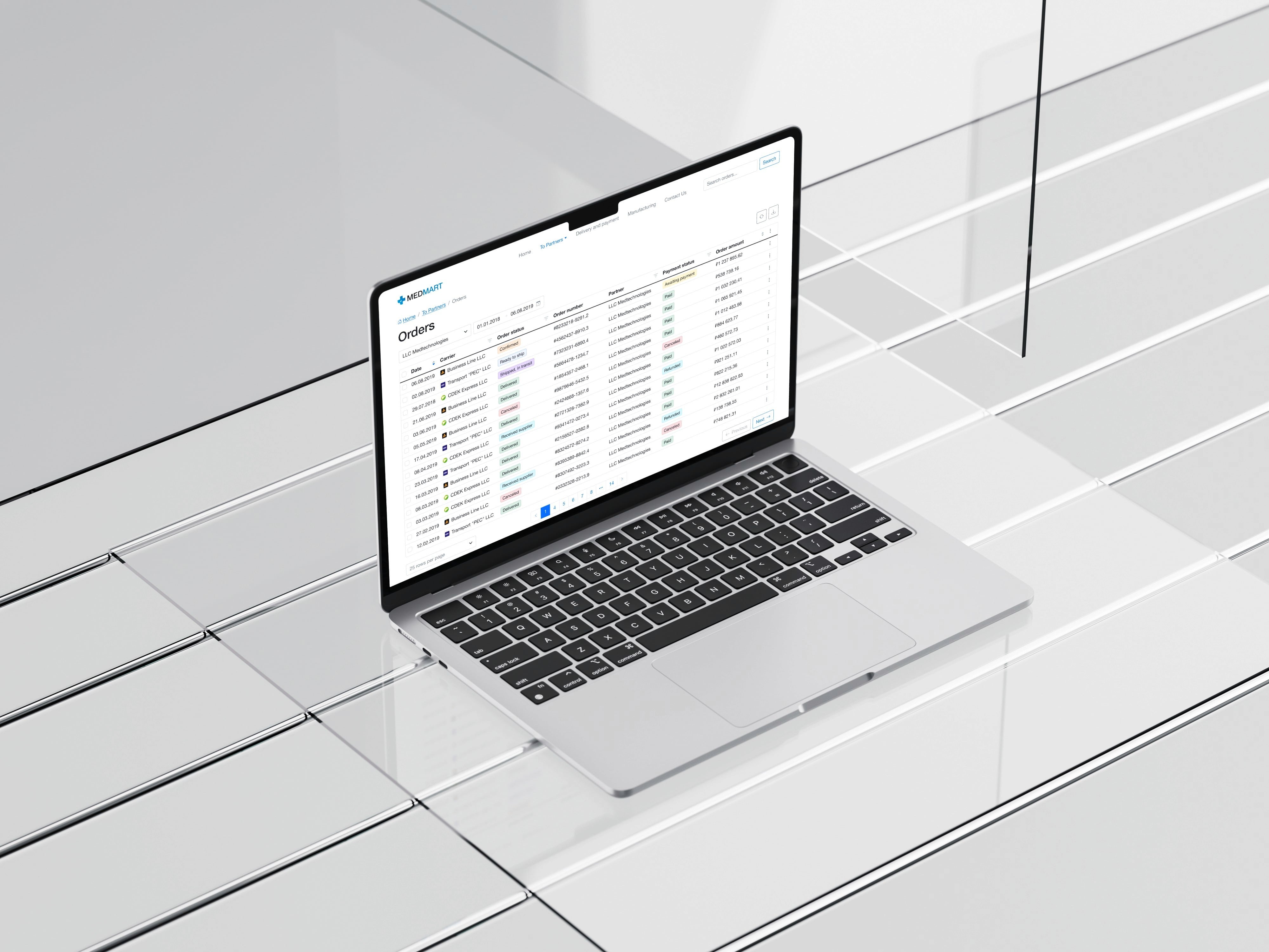
CityCall is a top call center provider for businesses nationwide, connecting companies with their customers.
Background and My Role
When I joined CityCall in 2022, I found the design process disorganized. Our internal tools – the CRM, customer service portal, and analytics dashboard – relied on scattered components and outdated practices. Instead of a cohesive system, we had a basic brand guide, isolated UI elements, and inconsistent marketing templates, making consistency a real challenge.
Although we had components for web and mobile, they lacked a proper system of tokens or atomic elements for efficient management. I was tasked with launching a unified design system to streamline workflows, improve scalability, and help the team quickly adapt to evolving business processes, all while ensuring consistency across platforms.

Problem and Why It Mattered:
Challenge
During a seven-week internal research phase, we identified key issues with CityCall’s internal tools (CRM, service dashboard, and analytics platform):
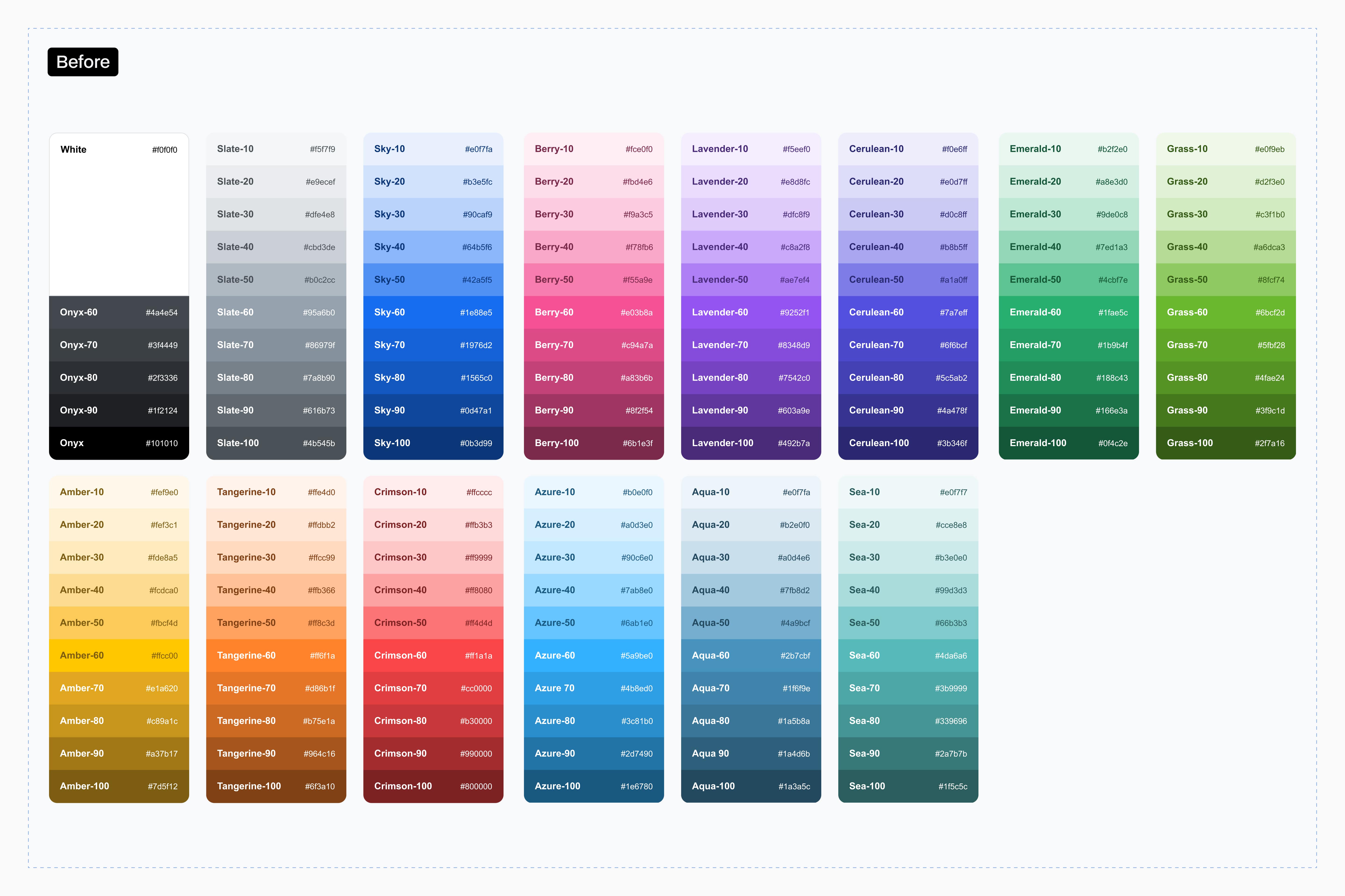
Without tokens for colors, spacing, or typography, designers and developers lacked a unified reference. Button states (e.g., hover, active) varied across platforms, forcing teams to recreate components and slowing product development.
UI elements like buttons, forms, and filters functioned differently across tools, confusing users and prompting developers to duplicate similar components on each platform.
Updating the UI for new features required extensive rework. Without a scalable framework, even small changes (e.g., adding a new CRM field) demanded hours of manual adjustments.
Why It Mattered
Without a standardized framework:
Product iterations slowed as teams debated component logic instead of focusing on product improvements.
Usability suffered from inconsistent workflows (e.g., mismatched forms between client-facing and internal tools).
Onboarding new hires took weeks due to fragmented documentation.

Process
Based on my experience managing dynamic systems, I organized the process into two main tracks:
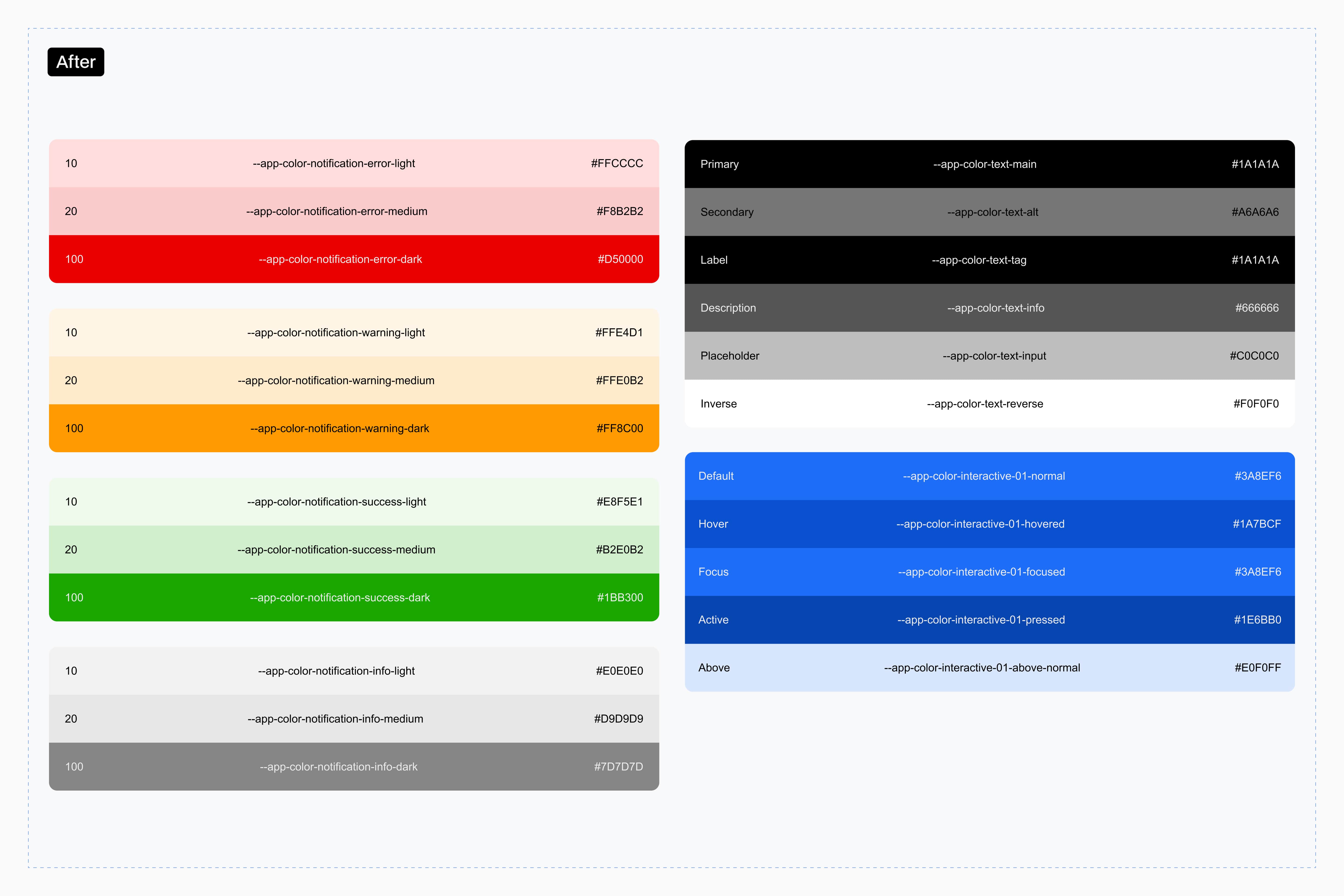
Atomic foundations first – I developed design tokens (colors, spacing, typography) and atomic elements (buttons, inputs) from scratch. This approach created flexibility for future scalability and established tokens as the single source of truth for various states.
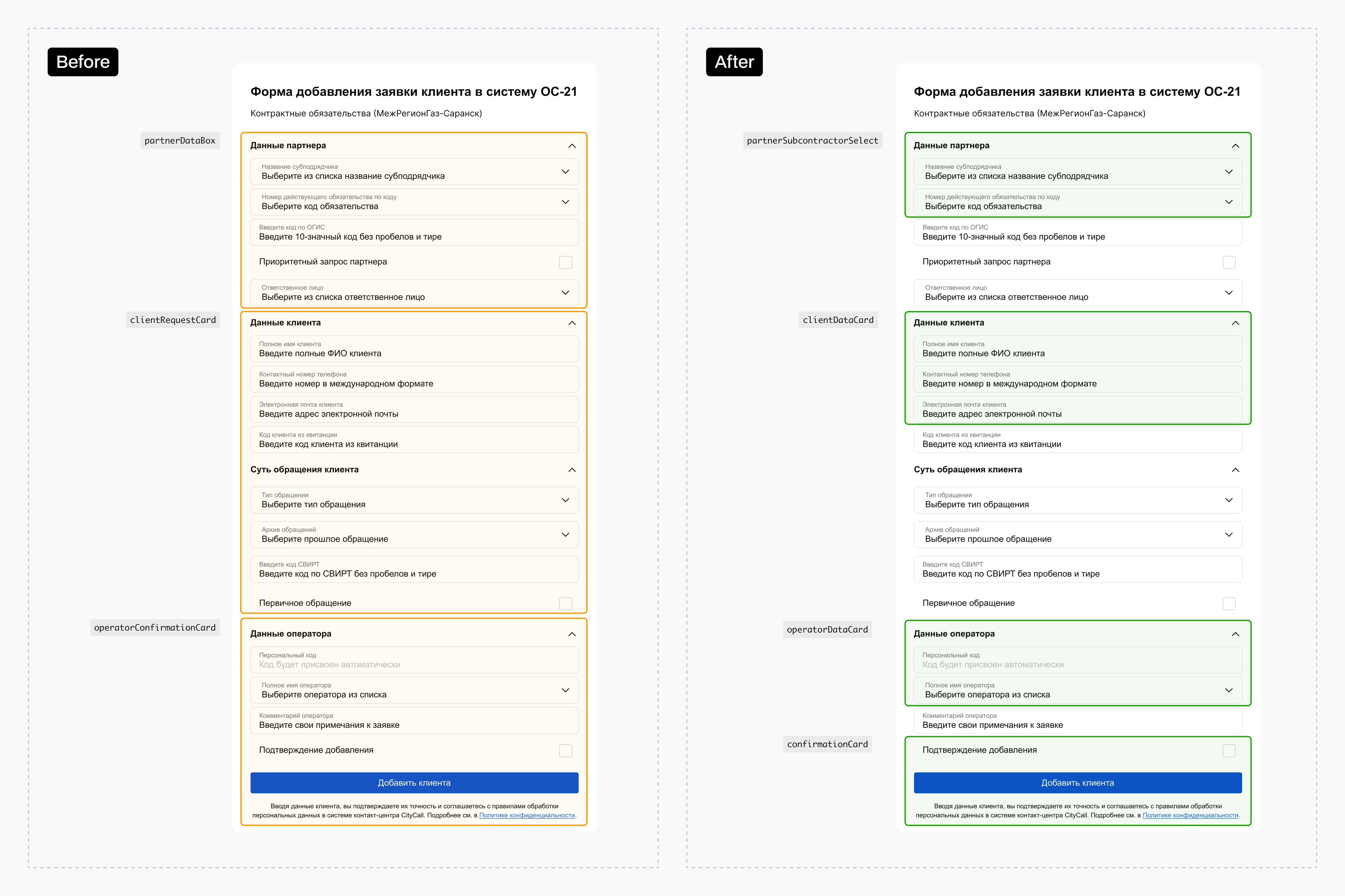
Component restructuring – I reviewed and rebuilt existing components using the new tokens, ensuring consistency across all platforms.

Building the Foundation
I developed design tokens and atomic elements, establishing core styles for colors, typography, spacing, and shadows. This cohesive system supports adaptable, future-proof design. I built and managed components in Figma, maintained internal guidelines, and collaborated closely with developers.
Approach
Developed a universal color palette featuring light and dark themes for operator environments.
Standardized font sizes and weights to improve readability.
Established spacing tokens to ensure consistent layouts.

Component Redesign
Following atomic design principles, I rebuilt components in stages – from foundational elements to complex modules. I prioritized frequently used components to create a structured, scalable system.
Approach
Buttons first – standardized by size and type to cover primary use cases and ensure consistency.
Icons & input fields – unified icon styles and restructured input fields to align with the new token system.
Molecules next - developed interactive elements like pop-ups, search bars, and dropdown menus to improve usability and maintainability.
Rebuilding existing components – reviewed and refined previous UI elements for visual and functional consistency across platforms.
Learning Through Mistakes
Because my previous experience focused on maintaining an existing design system rather than building one from scratch, I made several mistakes. Yet, these challenges became valuable learning opportunities that refined my approach.

Overly Complex Components
In the early stages of developing my components, I over-engineered them, leading to maintenance challenges – especially when adding new themes or interaction states. For example, my attempt at a “universal button” to cover primary, secondary, disabled, and icon-only scenarios resulted in tangled nested properties and complex overrides. Changing one state often disrupted another, complicating both design and development.
Solution
Simplify by breaking it down – instead of forcing one component to handle everything, I broke it into smaller, reusable variants:
Primary: for essential actions (e.g., “Submit,“ “Confirm“)
Secondary: for less critical actions (e.g., “Cancel,“ “Go Back“)
Tertiary: for text-based actions (e.g., “Learn More“)
This approach reduced complexity in Figma, eliminated deep nesting, and gave developers clear building blocks to update styles without affecting other variants.
Lesson Learned
While complex components might seem efficient to design, they’re hard to maintain. By focusing on atomic, context-specific patterns, we balanced flexibility and scalability, reduced inconsistencies, and sped up implementation.
Excessive Universality
Initially, I over-engineered components by trying to define every style variation – from specific color states to unique behaviors. This universal approach cluttered the design system with rarely used elements, making updates complicated for designers and developers. Instead of boosting efficiency, it created unnecessary overhead, as every minor UI change meant managing redundant styles.
Solution
Adopting a "Just-Enough" philosophy – rather than predicting every scenario upfront, I focused on core styles and iterated based on actual needs. I defined essential colors and styles with guidelines for future extensions, removed redundant UI states, and allowed controlled customization without overcomplicating the base system.
Lesson Learned
Trying to cover every possible scenario led to unnecessary complexity. Focus on essential styles and add variations only when needed, we kept the system lightweight, adaptable, and scalable.
Misidentified Components
I've seen it firsthand: not every recurring element should become a component. If an element is context-dependent and not universally reusable, it's better treated as part of a template rather than forced into the design system. Overusing components leads to system bloat, unnecessary complexity, and tougher updates.
Lesson Learned
Only create components for truly reusable elements with defined states and clear use cases. Unique forms, context-driven sections, or one-off layouts are best handled as templates.
Best Practicies
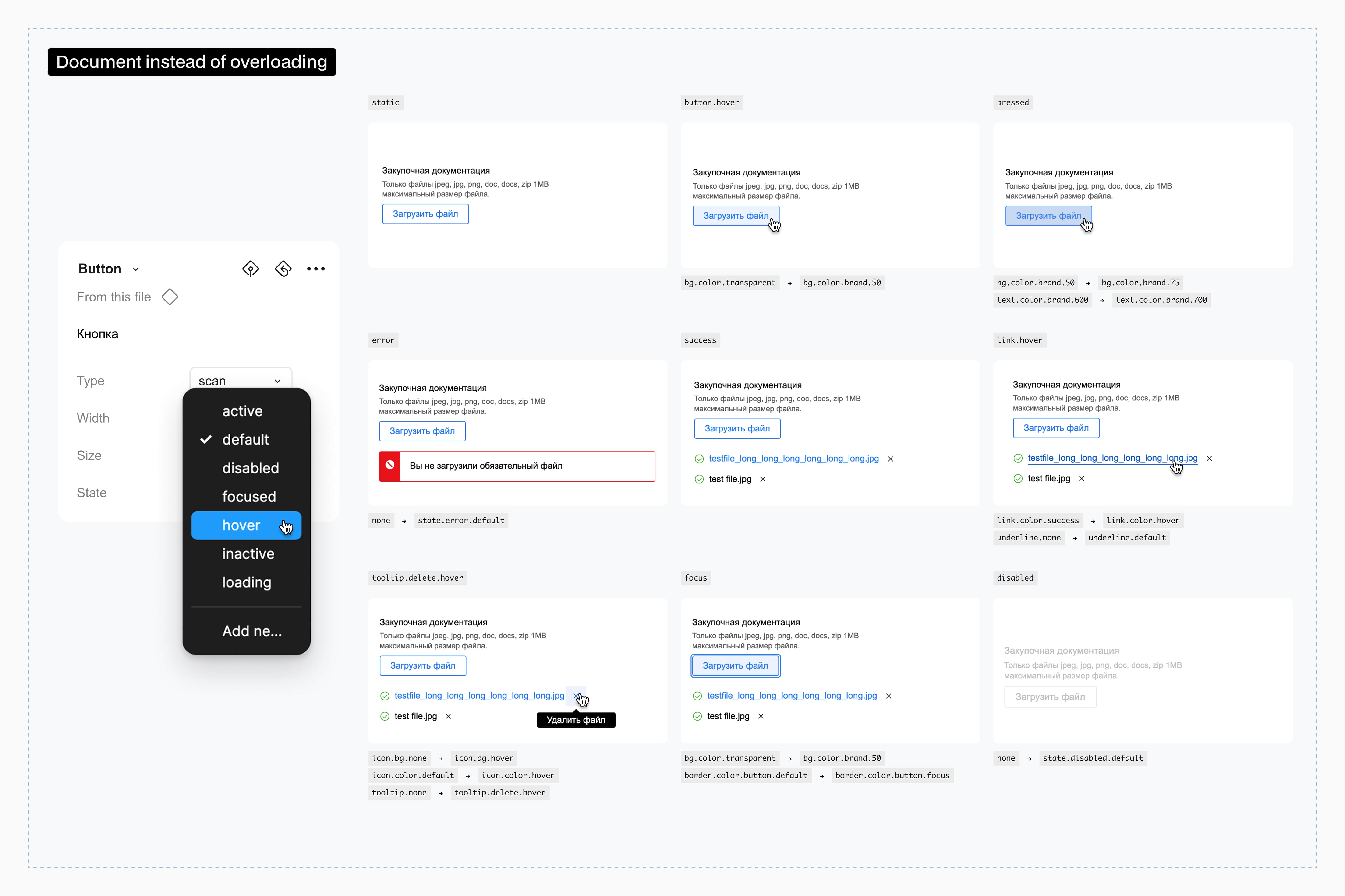
Document Instead of Overloading Components
Rather than loading components with multiple internal states, clearly document their interaction behavior. A well-maintained design library with accessible guidelines simplifies handoffs for developers.
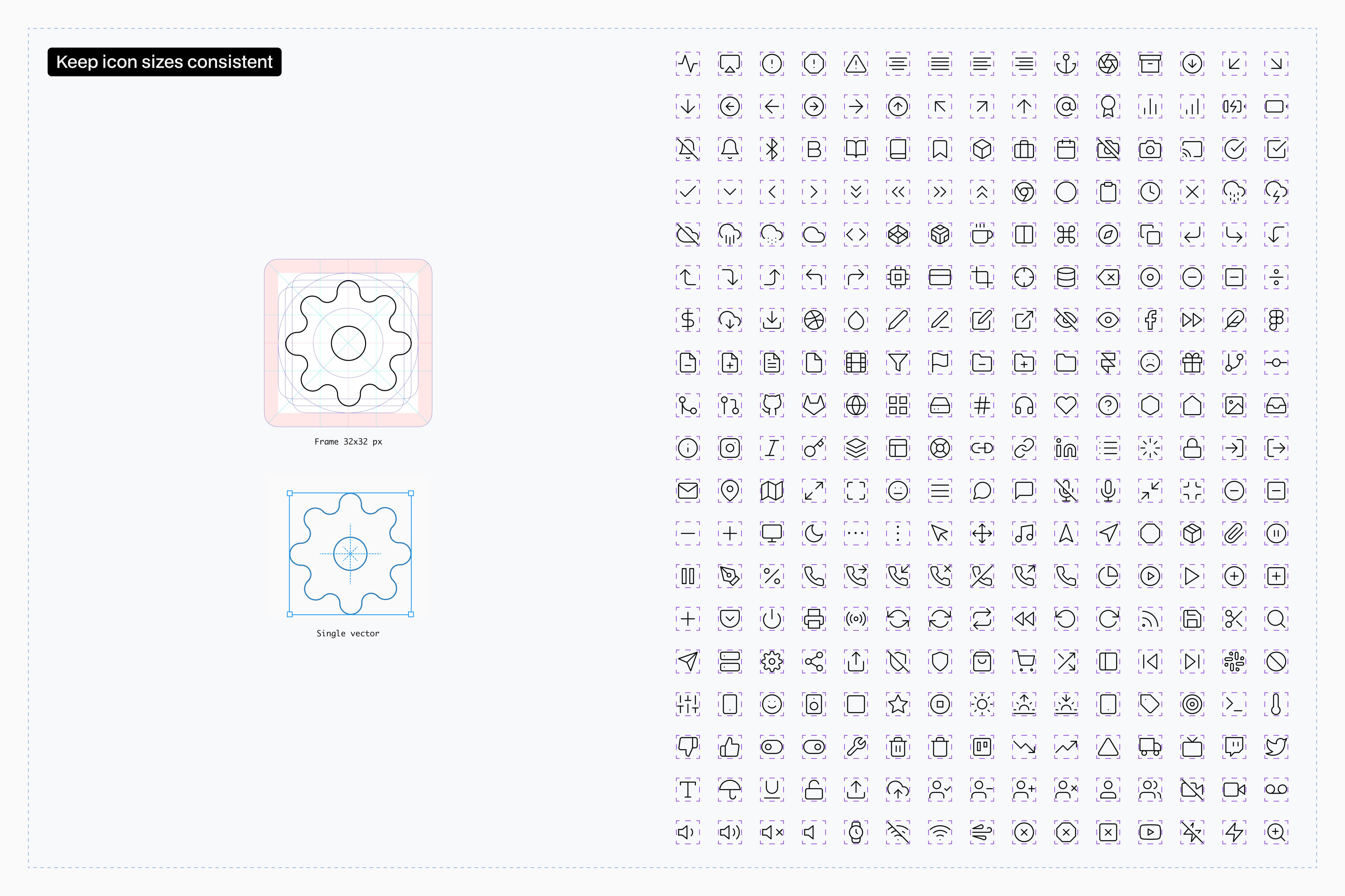
Keep Icon Sizes Consistent
Ensure all vector icons use consistent frame sizes for easy swapping. Arrows in different directions should be distinct icons, and each exported icon must be a single vector, not a group of shapes.

Use Clear, Standard Naming
Adopt community-approved naming conventions to prevent confusion. For example, using "chevron" instead of "arrow" streamlines component searches.
Structure Your Design Files
Organize design files by separating tokens, atoms, and components according to product or functionality. This keeps the system neat and manageable.
Preliminary Impact & Results
Since the project is still active, providing final quantifiable results is challenging. However, early optimizations have shown tangible improvements:
More efficiency: reduced handoff time by roughly 25% through improved developer collaboration, better documentation, and clearer component structures.
Scalability: the design system now adapts to new features and supports additional products without extensive rework.
Improved consistency: eliminated visual discrepancies for a more cohesive user experience across applications.
Reflection: What I’d Do Differently
Budget Awareness
Creating a custom design system is resource-intensive, requiring significant time and money. A more efficient strategy is to use existing libraries like Material Design or Apple Design Guidelines and tailor them to specific needs rather than building every component from scratch.
Prioritizing Accessibility from the Start
Instead of treating accessibility as an afterthought, I would integrate WCAG compliance reviews early. This proactive approach fosters inclusivity and minimizes later rework.
Adopting an Incremental Approach
Rather than developing a complete system upfront, I would focus on essential components and expand as needed. This method simplifies adoption and enables faster iterations without unnecessary complexity.
Conclusion
Building a scalable design system for CityCall was both challenging and pivotal – a truly rewarding milestone. This is just the beginning. A design system isn’t a one-time project, it’s a dynamic ecosystem that grows with the product.