8:34:38 PM
, Philly
Up Next
Up Next
Scroll Down
Up Next
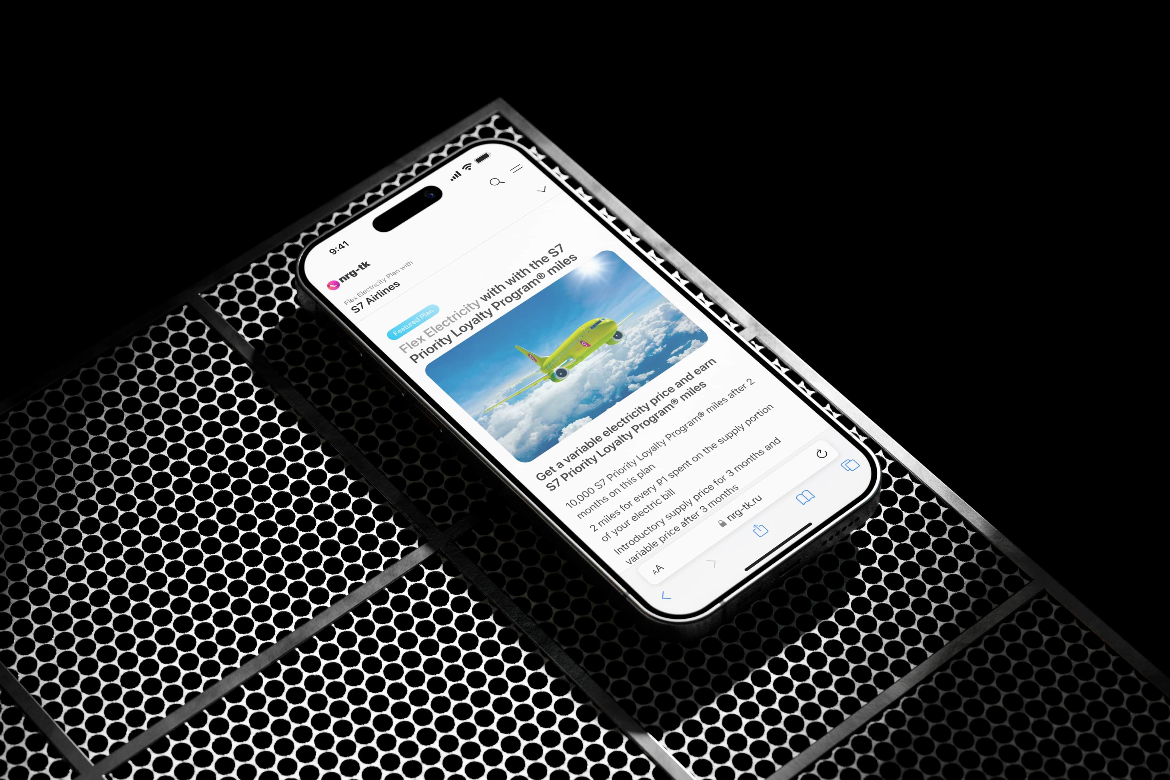
NRG-TK Mobile Website Redesign
2021
UX/UI
Commerce
B2C
Role: UX/UI Designer
Contributions: UX, UI, Interaction Design
Methods:
Customer interviews, market research, usability testing, customer journey, information architecture, rapid prototyping and content design
Outcomes:
3.4% increase in conversion rate
1.2% increase in add-to-cart rate
3.9% decrease in drop-off rate
Behind the wall
NRG-TK, a local energy distributor, has decided to update the design of its retail website as part of a program to develop and promote integrated energy plans in conjunction with transportation companies and charitable foundations.
The previous version of the site was not fully optimized for mobile devices and contained excessive information, which made it difficult to get acquainted with new products and register customers. The new version should correspond to the new brand of the company and provide convenient functionality for mobile devices.
Was responsible for designing the customer journey from landing page to plan comparison page (UX, UI and content organization).

What was important to know?
To begin our process, we engaged with our research team to schedule some in-person interviews to help gather context on our users.
Our key focus areas were:
What are the challenges or barriers with website use customers?
What’s important for a great mobile experience?
What’s more relevant information for them for decision-making?
What are customer needs and unmet needs with the website?
How are customers interacting with a lot of information?
Prototypes feedback
Core customer needs
During the research, four areas were identified that are of concern to our clients (within the framework of my project):
Customers value quick and easy access to information tailored specifically for them. This means that the user's transition from landing to obtaining data related to their location should occur as quickly as possible, and the information should be structured in such a way as to reduce cognitive load.
Customers want to understand the reasons why they are being asked to make a choice, so they want to see clear and understandable explanations. No one likes to feel in the dark of ignorance.
It is important to show customers the advantages of the chosen plan, explain what value it represents, and ensure transparency of the terms.
Customers want to quickly understand the key differences in their choice, so the information should be clear and reflect the specifics of each option.
What was done
We have fully redesigned the mobile version following new branding, as well as completely rebuilt the process of customer interaction with information and decision-making.
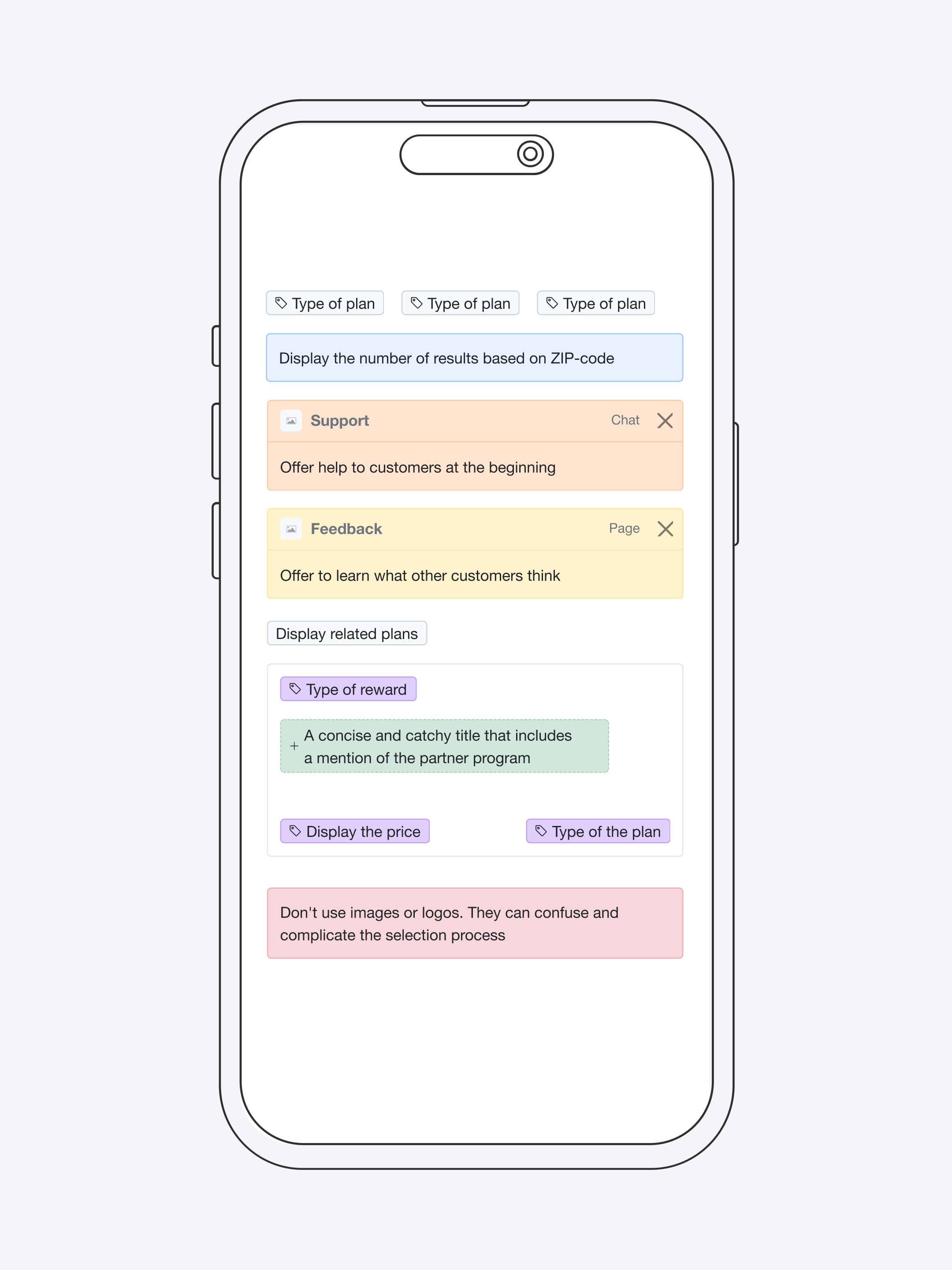
Reduced the duration and number of user steps from landing to getting results, also allowing them to select locations using different ways. The time to complete the task before and after the changes decreased by 11.4%.
The information structure has been optimized by reorganizing, grouping, and removing redundant elements based on the results of A/B testing. This made it possible to improve the user experience and speed up the search without cognitive overload. The time spent on completing the task was reduced by 6%.
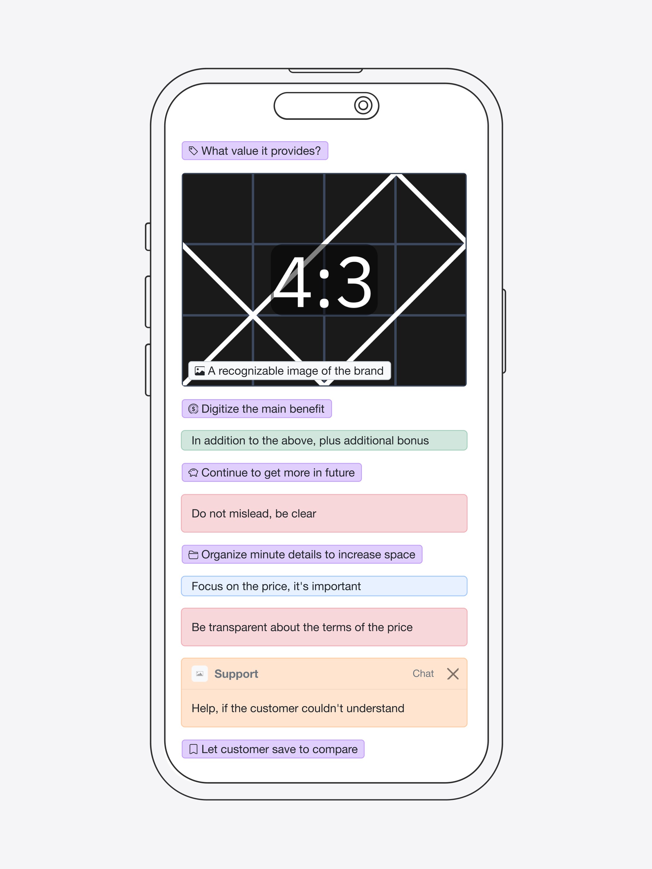
The content submission has been redesigned to better interact with customers. It focuses on the benefits and value it provides for them, based on the results of tests, which have increased the task success rate by 2.9%.
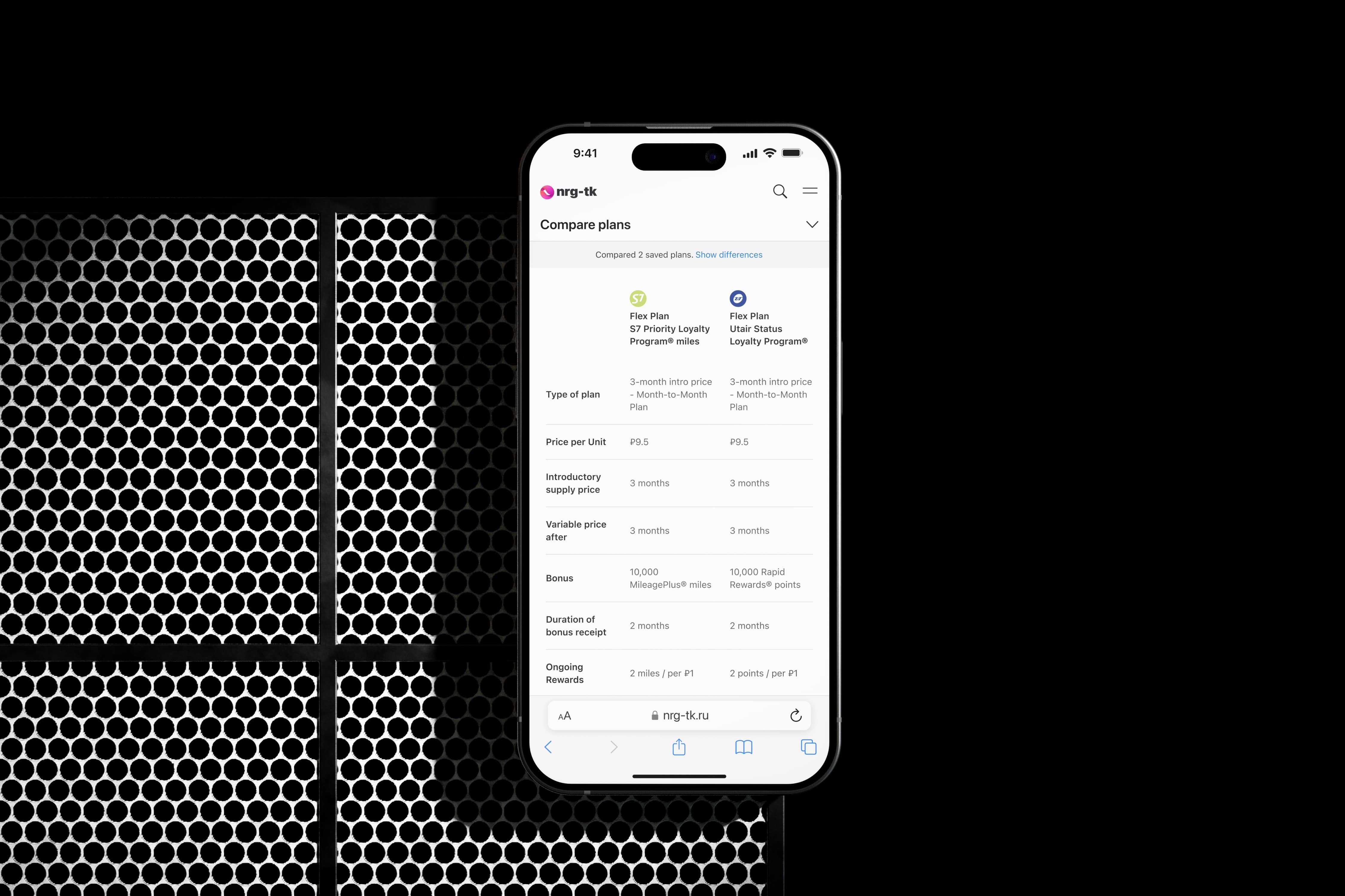
The comparison feature was created to quickly identify the main differences without unnecessary elements and complex filters. As a result, the time spent on completing the task before and after the implementation was reduced by 6.3%.
During each stage of the customer's journey, we provided clear explanations of what was happening or why they needed to take any actions. Additionally, we offered them support through chat. As a result, customer satisfaction increased by 2.1%.
Thoughts and what next
Turning back at that project, I could say we did a great job. We gave customers an easy and simple way to digest more important information and make informed decisions. Also, we helped the business to put the first brick on the way to build its mobile app based on these design decisions, with future modifications based on customer feedback.
8:34:38 PM
, Philly
Up Next
Up Next
NRG-TK Mobile Website Redesign

2021
UX/UI
Commerce
B2C
Role: UX/UI Designer
Contributions: UX, UI, Interaction Design
Methods:
Customer interviews, market research, usability testing, customer journey, information architecture, rapid prototyping and content design
Outcomes:
3.4% increase in conversion rate
1.2% increase in add-to-cart rate
3.9% decrease in drop-off rate
Behind the wall
NRG-TK, a local energy distributor, has decided to update the design of its retail website as part of a program to develop and promote integrated energy plans in conjunction with transportation companies and charitable foundations.
The previous version of the site was not fully optimized for mobile devices and contained excessive information, which made it difficult to get acquainted with new products and register customers. The new version should correspond to the new brand of the company and provide convenient functionality for mobile devices.
Was responsible for designing the customer journey from landing page to plan comparison page (UX, UI and content organization).

What was important to know?
To begin our process, we engaged with our research team to schedule some in-person interviews to help gather context on our users.
Our key focus areas were:
What are the challenges or barriers with website use customers?
What’s important for a great mobile experience?
What’s more relevant information for them for decision-making?
What are customer needs and unmet needs with the website?
How are customers interacting with a lot of information?
Prototypes feedback
Core customer needs
During the research, four areas were identified that are of concern to our clients (within the framework of my project):
Customers value quick and easy access to information tailored specifically for them. This means that the user's transition from landing to obtaining data related to their location should occur as quickly as possible, and the information should be structured in such a way as to reduce cognitive load.
Customers want to understand the reasons why they are being asked to make a choice, so they want to see clear and understandable explanations. No one likes to feel in the dark of ignorance.
It is important to show customers the advantages of the chosen plan, explain what value it represents, and ensure transparency of the terms.
Customers want to quickly understand the key differences in their choice, so the information should be clear and reflect the specifics of each option.

What was done
We have fully redesigned the mobile version following new branding, as well as completely rebuilt the process of customer interaction with information and decision-making.
Reduced the duration and number of user steps from landing to getting results, also allowing them to select locations using different ways. The time to complete the task before and after the changes decreased by 11.4%.
The information structure has been optimized by reorganizing, grouping, and removing redundant elements based on the results of A/B testing. This made it possible to improve the user experience and speed up the search without cognitive overload. The time spent on completing the task was reduced by 6%.

The content submission has been redesigned to better interact with customers. It focuses on the benefits and value it provides for them, based on the results of tests, which have increased the task success rate by 2.9%.

The comparison feature was created to quickly identify the main differences without unnecessary elements and complex filters. As a result, the time spent on completing the task before and after the implementation was reduced by 6.3%.
During each stage of the customer's journey, we provided clear explanations of what was happening or why they needed to take any actions. Additionally, we offered them support through chat. As a result, customer satisfaction increased by 2.1%.
Thoughts and what next
Turning back at that project, I could say we did a great job. We gave customers an easy and simple way to digest more important information and make informed decisions. Also, we helped the business to put the first brick on the way to build its mobile app based on these design decisions, with future modifications based on customer feedback.
8:34:38 PM
, Philly
Up Next
Up Next
Scroll Down
Up Next
NRG-TK Mobile Website Redesign
2021
UX/UI
Commerce
B2C
Role: UX/UI Designer
Contributions: UX, UI, Interaction Design
Methods:
Customer interviews, market research, usability testing, customer journey, information architecture, rapid prototyping and content design
Outcomes:
3.4% increase in conversion rate
1.2% increase in add-to-cart rate
3.9% decrease in drop-off rate
Behind the wall
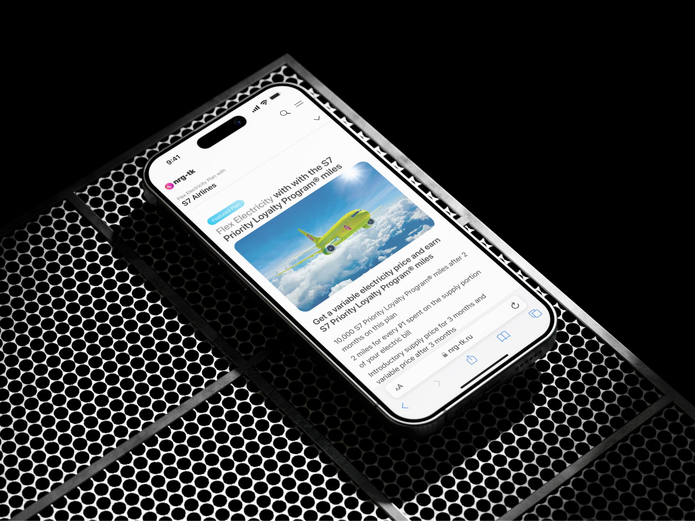
NRG-TK, a local energy distributor, has decided to update the design of its retail website as part of a program to develop and promote integrated energy plans in conjunction with transportation companies and charitable foundations.
The previous version of the site was not fully optimized for mobile devices and contained excessive information, which made it difficult to get acquainted with new products and register customers. The new version should correspond to the new brand of the company and provide convenient functionality for mobile devices.
Was responsible for designing the customer journey from landing page to plan comparison page (UX, UI and content organization).

What was important to know?
To begin our process, we engaged with our research team to schedule some in-person interviews to help gather context on our users.
Our key focus areas were:
What are the challenges or barriers with website use customers?
What’s important for a great mobile experience?
What’s more relevant information for them for decision-making?
What are customer needs and unmet needs with the website?
How are customers interacting with a lot of information?
Prototypes feedback
Core customer needs
During the research, four areas were identified that are of concern to our clients (within the framework of my project):
Customers value quick and easy access to information tailored specifically for them. This means that the user's transition from landing to obtaining data related to their location should occur as quickly as possible, and the information should be structured in such a way as to reduce cognitive load.
Customers want to understand the reasons why they are being asked to make a choice, so they want to see clear and understandable explanations. No one likes to feel in the dark of ignorance.
It is important to show customers the advantages of the chosen plan, explain what value it represents, and ensure transparency of the terms.
Customers want to quickly understand the key differences in their choice, so the information should be clear and reflect the specifics of each option.

What was done
We have fully redesigned the mobile version following new branding, as well as completely rebuilt the process of customer interaction with information and decision-making.
Reduced the duration and number of user steps from landing to getting results, also allowing them to select locations using different ways. The time to complete the task before and after the changes decreased by 11.4%.
The information structure has been optimized by reorganizing, grouping, and removing redundant elements based on the results of A/B testing. This made it possible to improve the user experience and speed up the search without cognitive overload. The time spent on completing the task was reduced by 6%.

The content submission has been redesigned to better interact with customers. It focuses on the benefits and value it provides for them, based on the results of tests, which have increased the task success rate by 2.9%.

The comparison feature was created to quickly identify the main differences without unnecessary elements and complex filters. As a result, the time spent on completing the task before and after the implementation was reduced by 6.3%.
During each stage of the customer's journey, we provided clear explanations of what was happening or why they needed to take any actions. Additionally, we offered them support through chat. As a result, customer satisfaction increased by 2.1%.
Thoughts and what next
Turning back at that project, I could say we did a great job. We gave customers an easy and simple way to digest more important information and make informed decisions. Also, we helped the business to put the first brick on the way to build its mobile app based on these design decisions, with future modifications based on customer feedback.
